Concept Board

Our Process: Pinning Together!

Our Process: Pinning Together!

Identifying you style can be tough, especially when you are flooded with beautiful imagery on social media. It can be challenging to use one word to describe a style, so we don’t ask our clients to use words, instead we ask them to pin. Yes, we use Pinterest.com as a tool in our design process. We particularly like the aspect of client and architect sharing this board together as means of real-time collaboration. We do set those specific project boards to “private” so we can create virtually in the same confidence as we would in a face-to-face design meeting.

Read More

Spring Design Projects Keeping Us Busy

Spring Design Projects Keeping Us Busy

Last year we published a blog about our how our Quarantine Design Projects are keeping us busy. This year is no different. With so many exciting things going on from construction to consultations, we haven’t had much time to share our content. Here’s an overview of what’s happening over at Studio BKA

Read More

Better Than A Flip: Re-Imagining Our Forever Home

Growing up in the suburbs of New Orleans, I always imagined myself as an adult living in a Victorian-Style Home. The size of the house never mattered much to me. I grew up in a two-story, suburban home, but found the inefficient extra space that required cleaning annoying. “Why have rooms that people never use,” I used to ask my mom about the “formal” living room. My 11 (post-college) years in NYC reaffirmed my preference for minimalism and efficient use of space. So when it came time to purchase my adult home in New Orleans, I surprised myself when my husband and I selected a 1950s raised ranch-style home along Bayou St. John.

“I surprised myself when my husband and I selected a 1950s raised ranch style home”

Construction Photos (In Progress)

Location was more important to me than the mark-up we would need to pay for one of the Victorians on our block. My dreams of high ceilings and antique floor boards was thrown out the window. But I had a vision for this small house, one that evolved as we lived in the house five years prior to renovating.

“I have a vision for this house.”

Floor Plan Before

Floor Plan Before

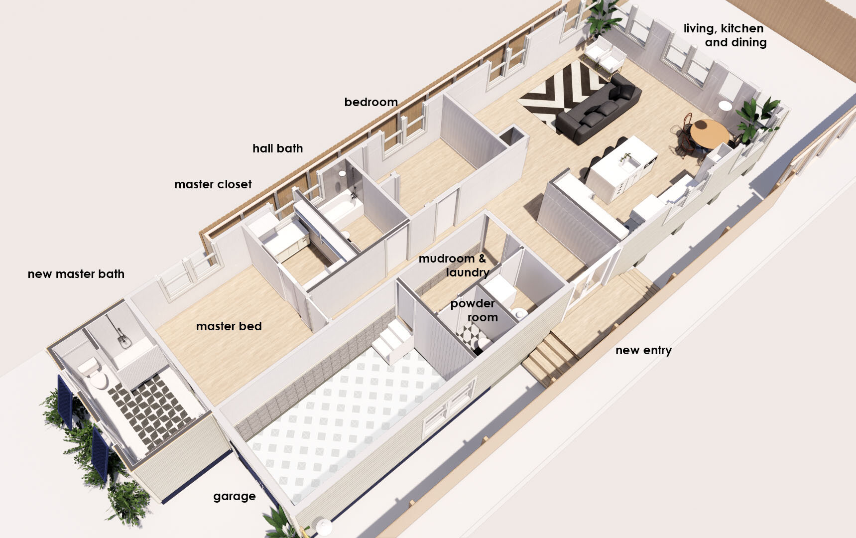
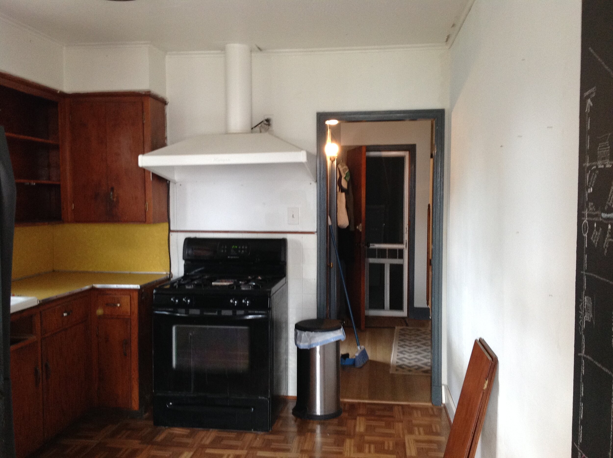
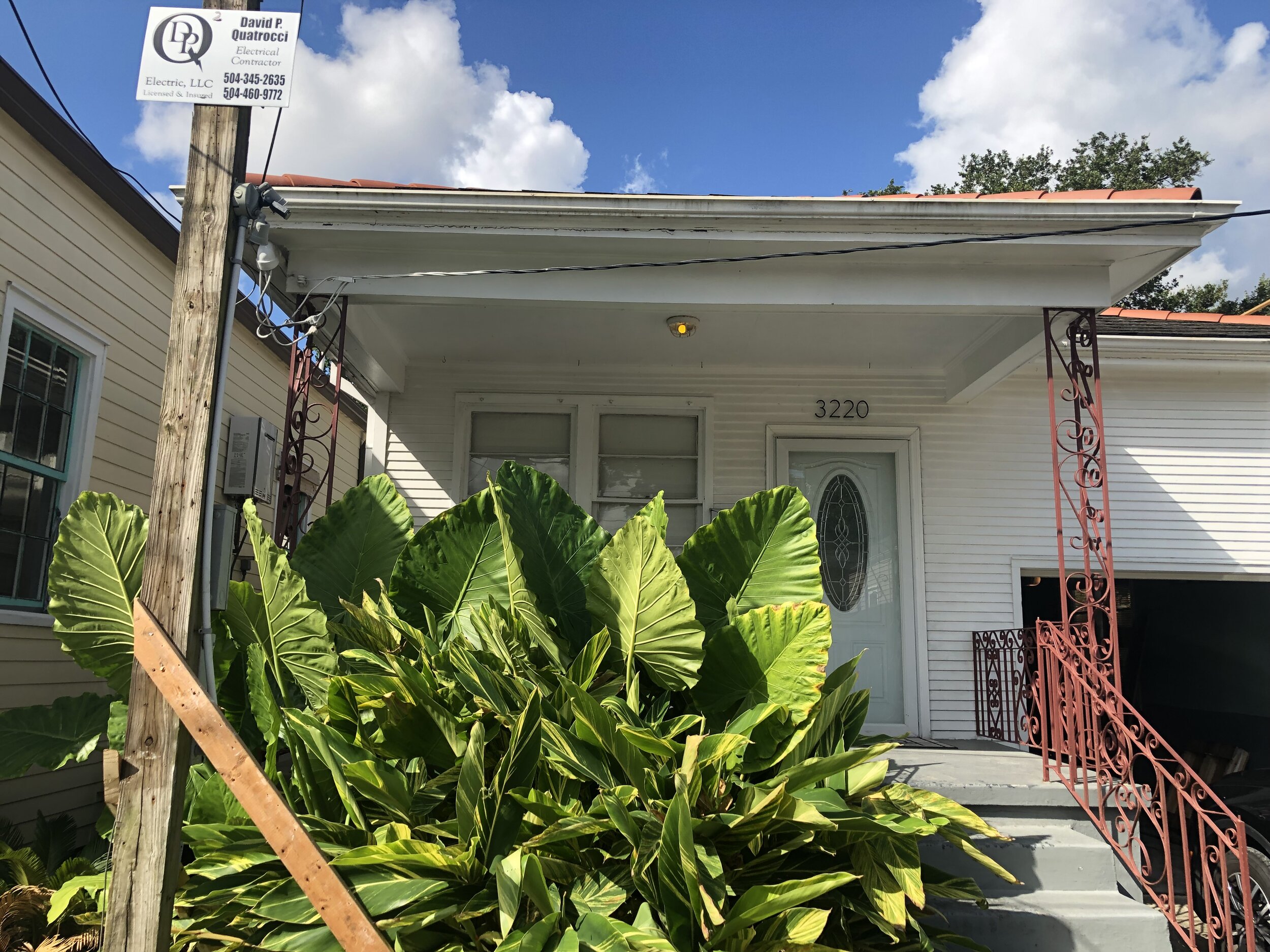
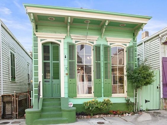
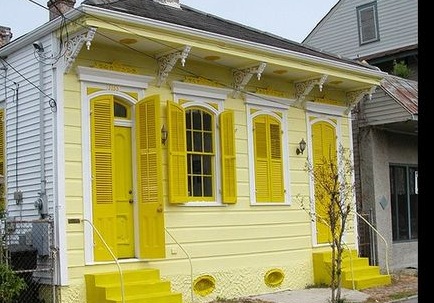
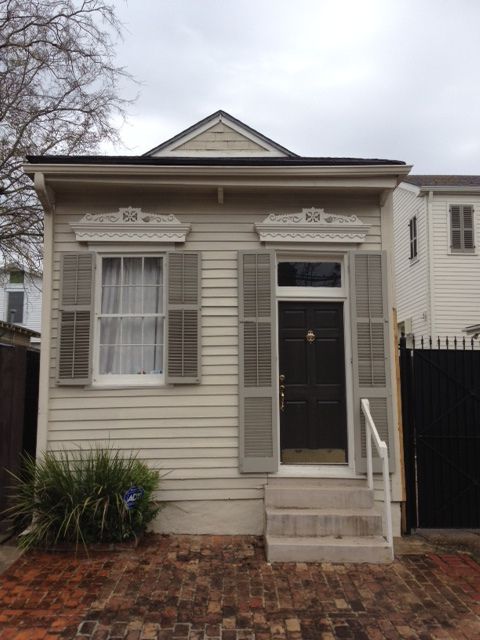
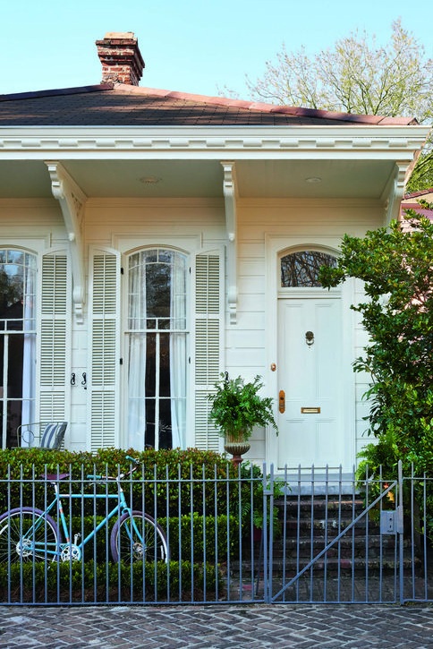
The home had an inefficient floor plan similar to neighboring shotgun homes. It was 1100 square feet + a 300 garage. It was 2 bedrooms and 1 bathroom with an awkward shaped bonus room that we used as a home office. We knew that we could possibly steal square footage from much of the unused garage space and reconfigure the floor plan towards our lifestyle.

We originally had the idea to convert this home to a three-bedroom/two-bathroom but before we started the financing process, we founded our company Studio BKA Architects. This put the renovation on pause.

Our problem-solving architect brains used this time for critical and creative planning.

We benefited from living in the house for five years prior to renovating to get a sense of our favorite spots in the house were and what rooms had the best natural light. We knew what rooms were over-sized & under-used. Our problem-solving architect brains used this time for critical and creative planning.

We really wanted to create our forever home.

Once the time came for the renovation to start, we no longer looked at the house as an investment property. We really wanted to create our forever home.

Our Design Approach:

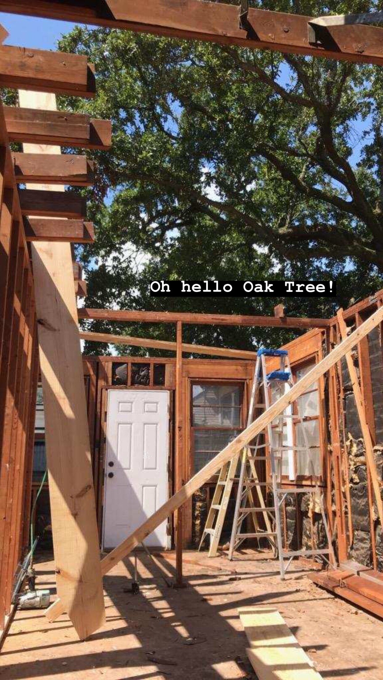
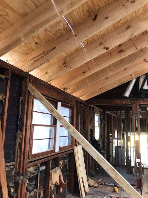
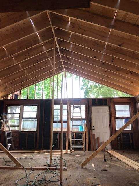
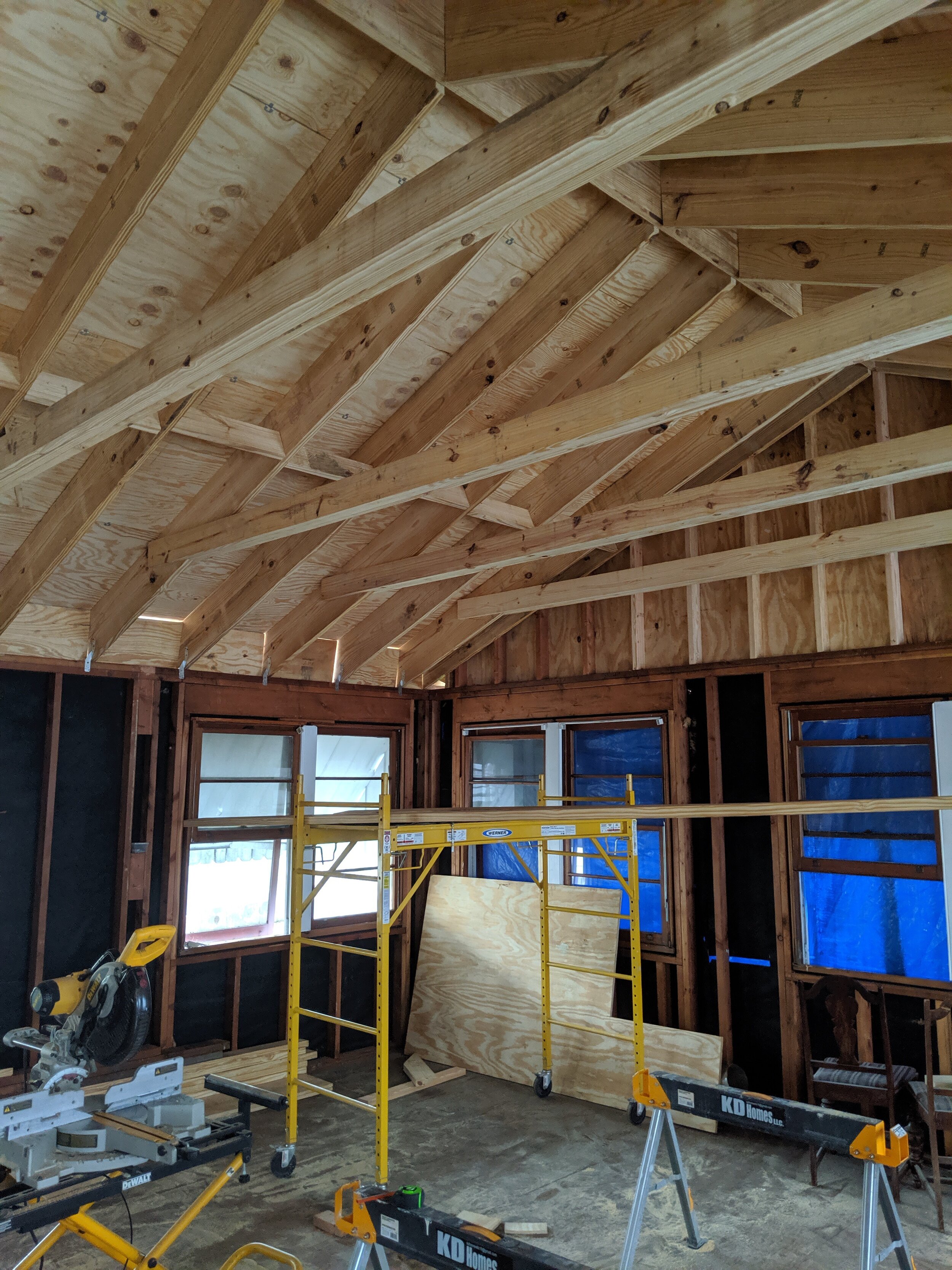
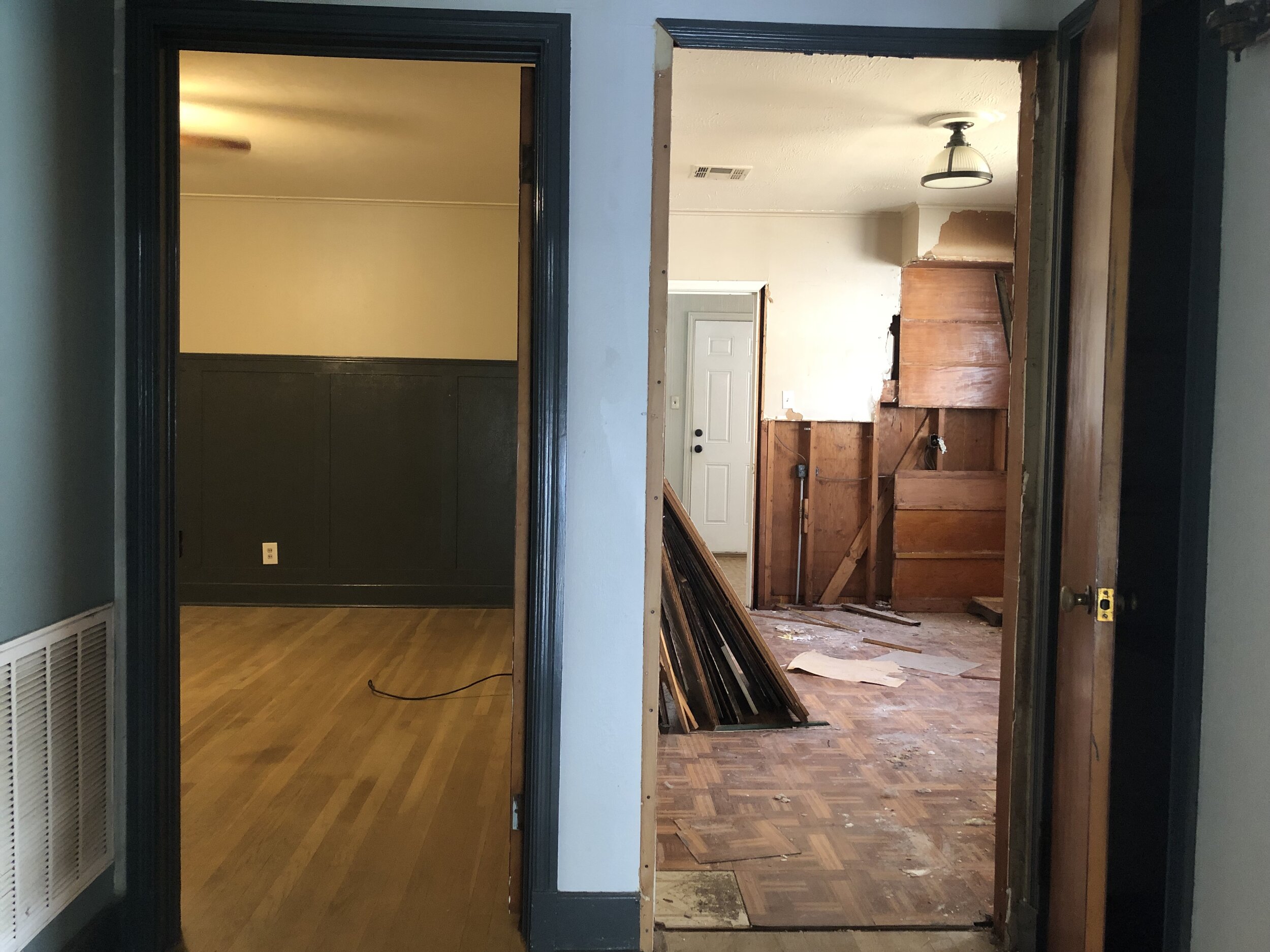
We saw an opportunity to create a large entertaining zone in the back half of the house. We planned to remove the walls and ceiling joists in the large entertaining room (comprised of kitchen+living+dining).  It makes for a functional and attractive living room with access to the backyard. We knew we needed to vault the ceilings, since such a large room with a low ceiling would feel oppressive and cave-like. To clear span the large space, we upsized the rafters and used rafter ties to avoid having any midspan supports and use our existing outer foundation. The low pitch roof was a good candidate for vaulting as the proportions still feel cozy and residential. In this scheme, we took advantage of the sunlight penetrating into the long narrow house and access views of the lush green backyard.

We knew we needed to vault the ceilings, since such a large room with a low ceiling would feel oppressive and cave-like.

Floor Plan After

Floor Plan After

The existing front porch will be built-out and transformed into a master en-suite. By removing the front door entrance, the new entrance will be on the side of the house, which is not uncommon in the denser neighborhoods of New Orleans, where homes are built out to the sidewalk.  The garage remains but is smaller now, but still able to accommodate our SUV. I really like having a garage because it makes for secure spot in a neighborhood where many people park on the street for music festivals and events on the bayou.

Lastly our design approach for interior materials and finishes aims to pay reference to the time in which the home was built: the 1950s, modernism, with less ornamental trim work, more wood grain paneling and minimalist styling.

Before Photos Below

If you are interested in our renovation progress, follow us on Instgram: @studiobka or #stannreno

A Visual Guide to Selecting Your Exterior Color Scheme

Ben and I are in the process of renovating our house in New Orleans, and I can’t help but think about the exterior color scheme. Everywhere you look in this eccentric city, there are colorful buildings and homes painted with bright hues, pastel monochromatics, and neutral shades. The color palette of the architecture here creates unique city blocks that are backdrops for urban photoshoots, and takes us on a colorful, rhythmic ride. With so many examples to look at, why am I having such a hard time making this selection??

The color palette of the architecture here creates unique city blocks that are backdrops for urban photoshoots, and takes us on a colorful, rhythmic ride.

I love color. I have a whole Pinterest Board dedicated to it. I give as much importance to color and materiality as I do to architecture because thoughtful color adds so much. It demonstrates values. It expresses ideas and emotions. Color enriches our perception of space, the same way light and form do. I will touch lightly on the basics of color theory and then jump right into how I put together my exterior color scheme.

Color Basics

Who here has heard of the Color Wheel? I hope you ALL raised your hand. The color wheel represents the presence of light waves in color, each with a unique wavelength, as evidenced by the most magical example, the rainbow.

The Primary, Second and Tertiary colors might be the first box of crayons you ever received, making you an expert in the color wheel! But what about tint and shade? What are those?

basic-color-theory-wheel.jpg

  • Tint: The act of lightening a color by adding white to it.

  • Shade: The act of darkening a color by adding black.

  • Tone: Slightly darkening a color by adding gray.

  • Saturation: The highest level of pigmentation, no change with black, white or gray.

  • Value: Variation in light and dark.

Color Combinations

Color combinations, or as a designer may say, color palettes or color schemes, are any combination of colors. These combinations can change the mood or tone of anything you are trying to represent from logo design to architecture.

  • Combinations with less contrast create a mood of restraint, subtlety, discreetness and understatement.

  • Combinations with more contrast create a mood of drama, excitement and conflict.

In planning a color scheme, contrast is not just created by changing the entire color, but by using the same or similar colors with different values and saturations.

Color Palette Selection

Some of my favorite color palettes are created by design-seeds.com. I found the below images on Pinterest by just searching for the term ‘color palettes.’ Here you can get palettes already generated for you, but if you are interested in exploring your own combinations of color, read more below.

Guide to an Exterior Color Scheme (New Orleans Edition):

I would stick to selecting 3 to 4 colors at most. Proper proportions are important. One color must be the dominant color, there must be a subordinate color and then an accent color or two. Think 50%, 30%, 15%, <5% ratio.

Below are some of my favorite examples of colorful New Orleans houses:

Top Row: Monochromatic, colors of varying tones, tints and shades
2nd Row: Complementary colors
3rd Row: Neutrals
Bottom Row: Vibrant, Bold colors

I would stick to selecting 3 to 4 colors at most!

What I know works:

  • For larger color combinations, select colors with varying levels of shades or tints. Your accent colors can be complementary colors. This helps your eyes find a place to rest.

  • When going with darker or deeper shades for siding, use white or vibrant colors to offset the dark color.

  • More than 4 colors almost always feels too busy. But hey, these are just my guidelines, not rules! The 4th color, the brightest/boldest color, should always be used sparingly, <5%. See: Front Door Colors above.

  • In Monochromatic schemes, use the darkest tone to emphasize detail for example, the shutters, doors and quoins, while the siding should be painted the lightest or most neutral of hues.

Color Combo Renderings

Below is a quick color study for our favorite residential project, our own house! We tried on a few of these principles - monochromatic with shifting values, neutrals with a vibrant color on important elements, and never more than 4 different colors. Check out our Instagram story to vote on your favorite scheme!

blue.jpg
gray and tourq.jpg
rust.jpg
yellow.jpg

content source: The Complete Color Harmony, Pantone Edition by Leatrice Eiseman

Let us know what you think and stay up to date my subscribing to our newsletter!

Subscribe to the Studio BKA newsletter!

* indicates required